
Thursday, 11 April 2013


Wednesday, 10 April 2013

Evaluation Q5: How did you attract/address you audience?
If you click on the images, It would take you to Flickr where I have added annotations on my work.
Monday, 8 April 2013
Evaluation Q2: How does your media product represent particular social groups?
For question 2 I have produced a video with my voice talking through out. Enjoy :)
Tuesday, 2 April 2013
Monday, 1 April 2013
Completed Contents page & DPS
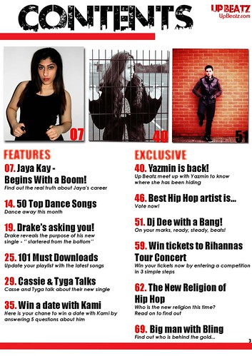
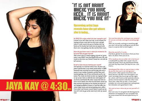
Here is my completed contents page and double page spread. Looking back at my flat plan, I have still carried out the same layout but have slightly changed few areas to make it look more professional and realistic.
 |
| Contents page |
 |
| Double page spread |
Sunday, 10 March 2013
Changes applied
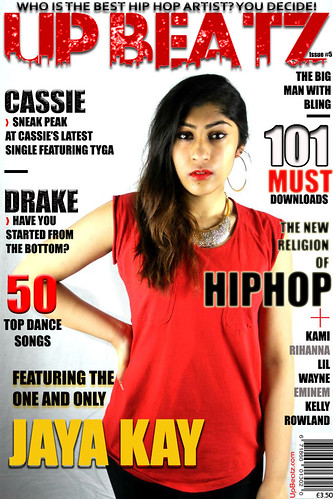
I looked back at my front cover and thought something was missing. Then I decided to add more text and use more editing skills on my front cover which I did by changing the font to something clearer but bold which was 'Impact' and adding drop shadows and strokes in the selected text.
Due to having to add more text on my front cover and making it look more like a real magazine front cover, I had to re-do my contents page text which I did so. I have changed my layout of my contents page slightly because there was a load of text and was not fitting in as I planned it on my contents page flat plan. I have not fully finished creating my contents page as I have one more image to fit on to it but here is my changed & improved front cover:

Due to having to add more text on my front cover and making it look more like a real magazine front cover, I had to re-do my contents page text which I did so. I have changed my layout of my contents page slightly because there was a load of text and was not fitting in as I planned it on my contents page flat plan. I have not fully finished creating my contents page as I have one more image to fit on to it but here is my changed & improved front cover:

Wednesday, 6 March 2013
DPS title
The reason why my title is 'Jaya @ 4:00' is because as I did my research before at looking at different double page spread's for Hip Hop magazines, a particular double page spread caught my attention and thought it would work well if I was to follow the convention of it. Here is what it looks like:

Where I am currently with creating my double page spread is I have only placed the main image, the small image, the big quotation and importantly the heading for the article.

The colour scheme of black, yellow/orange, white and black is consisntly running through out my front cover, contents page and double page spread (as you can see with the title.) The effect of the time in the title shows that the artist is present with the interviewer (which would be the magazine people).

Where I am currently with creating my double page spread is I have only placed the main image, the small image, the big quotation and importantly the heading for the article.

The colour scheme of black, yellow/orange, white and black is consisntly running through out my front cover, contents page and double page spread (as you can see with the title.) The effect of the time in the title shows that the artist is present with the interviewer (which would be the magazine people).
Tuesday, 5 March 2013
My front cover

Here is my compelted front cover image I created on PhotoShop. I have followed my flat plan but the changes I have applied is how the front image is and what my artist/model is wearing and adding extra's in as I noticed it was part of my convention and the magazine front cover I was using for my inpiration e.g. a website ''UpBeatz.com'' and adding an issue number around the magazine name.
Contents page so far
I created my contents page on photoshop as I found it easier as I was used to photoshop more. I did not find anything different with what I could not and can do in both programs. Working from my flat plan for my contents page, I started to apply couple images before I entered my text which I did so and here is where I am so far.

All I need to do is add two more images on to my contents page then it would become complete according to my flat plan. The things I have changed is that I decided to add in the magazine name in small on the top right hand side of the page as the page before looked much plainer. I also kept the concept of the theme colour and font of red, black on a white background, following my convention.

All I need to do is add two more images on to my contents page then it would become complete according to my flat plan. The things I have changed is that I decided to add in the magazine name in small on the top right hand side of the page as the page before looked much plainer. I also kept the concept of the theme colour and font of red, black on a white background, following my convention.
Monday, 4 March 2013
Editing DPS main picture
As usual, I visited my favourite website befunky.com. What I did with my main double page spread image is adjust the brightness and contrast. This would give my image a more vibrant and defined look as it goes with my convention. Here is what my final double page spread main image is:


Here is how I edited my image:

What inspired me to adjust the brightness and contrast of my image is I had been doing research on Hip Hop female artist photo shoot's to see what the convention is and here is what I used to help me edit my image:

As you can see this image is bright and you can see each feature in detail which seems more effective. Also you feel more involved when you are looking at the image due to the artist looking direct at the audience.
Wednesday, 27 February 2013
Interview written up!
The interview I wrote up included 8 questions (some long some short.)
Its 2013! Tell us Jaya, what are you looking forward to this year?
How did you music is what you wanted to do full time? Did you get inspired?
So tell us how did you develop your sound?
Its 2013! Tell us Jaya, what are you looking forward to this year?
Inoe woohoo! Urm, well what can I say to be
honest, I’m hoping to focus really hard on my music and get where I really want
to be, go on a holiday with my family as I’ve hardly had time to spend time
with them ever since getting into this whole music thing..
How did you music is what you wanted to do full time? Did you get inspired?
Well since I was 5, I loved singing a lot
and as I grew older, I was really and to be honest, ONLY, into hip hop/rnb
music. Like my role model at the time was Cassie! I loved her and still do.
(ofcourse)
So tell us how did you develop your sound?
Um basically it all started when I was 16
years old when I performed in my school talent show in 2009. Someone had recorded
me performing solo and it went all over twitter, facebook and youtube and I
started getting a lot of likes and thumps up for my talent. This made me think
to take my singing further as my career which I did so with the love and
support of my family and friends. My older cousin had links to local record
labels and when he told them about me they seemed really impressed as he showed
a demo of my singing/rap. Before I knew it,
I had few offers to make songs locally and within a boom! I started
getting more offers from other well known record labels. I could not believe
it! This is how I am here right now and wish to go next level with my sound..
You must have plans for working on new projects? Or are you currently working on something right now?
You must have plans for working on new projects? Or are you currently working on something right now?
Well I am currently working on something
right now, but I will not leak anything out just yet, let’s keep it a surprise
shall we haha
Describe yourself in 3 words..
Describe yourself in 3 words..
Mad, fierce, ghetto!
Who would you love to collab with in the future?
I would LOVE to collab with a couple of
people who are Cassie and Drake! Their my top favourite female and male hip hop
artists! One day lets see..who knows..
Sounds sick! But what we want to know is what do
you do when your not making music?
Haha oh no.. hmm I often spend a lot of
time with family and friends when I am not focusing on my job because with
their love and support, I am what I am today! Also love to go out late nights
for a drink with friends on the weekends, dinner, parties at each others, chill
sessions really! But when I have alone time, I often like to read which you
guys are probably getting shocked when you hear this! But its good to snug up
for a change in bed with a book i guess
We want to know where you see yourself in 5
years time?
Now now now, I’m not good with thinking too
ahead but im hoping to be very successful with my career, drama free life and
maybe find my Mr right..
Edited front cover image
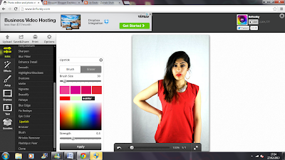
As the mast head and clothing are
red, my main colour running through the front cover is red. The image I took to
be my potential front cover image fits in well of what I expected apart from
one thing which was the camera did not pick up the vibrant red lipstick that would
of stood out if the camera did catch it. Then I went on the editing website (befunky.com)
to apply fake red lipstick and apply it on her lips. This is how I did and
looked like in the end..

Friday, 15 February 2013
Playing around with Indesign
From the lesson last week when I was introduced to Indesign,
I started to play around with it and by using my actual flat plan for my
contents page I thought I would see how it would look like by creating the
basics of my flat plan. I added in boxes of where my images would be places and
a one big box of where my text would be placed. Here is what I came up with (so
far):


1st step - front cover page
I decided which image of my model I would be using for my front cover page which as you can see is the one of my model wearing red. Why I chose this image to be on my front cover is because I thought the shot angel is a mid shot which is one of the conventions of Hip Hop/ R'n'B magazine covers that I have been researching on. Also because the eye level is looking direct and the camera which is effective as it looks more like the 'artist' is engaging with the readers.
I then used photoshop to make a start to creat my front cover page. As the orginal image as an effect of the background being faded from black to pure white (bottom right side going up), I thought this would look really effective as I would not have to play around with the background so much. I also wanted to see how an all plain background would look like. I did this by cropping the models image itself and pasting it on a black page. Why I did this is because I wanted to put both my potential front cover ideas together and see what makes a better background for my front cover. Here is what it looked like:
 I asked my teacher Miss Silva and my class mates which one looks better and everyone had said the left one (with the faded background) looks better than the plain one.
From their feedback, I decided to stick with the faded background image.
I then used photoshop to make a start to creat my front cover page. As the orginal image as an effect of the background being faded from black to pure white (bottom right side going up), I thought this would look really effective as I would not have to play around with the background so much. I also wanted to see how an all plain background would look like. I did this by cropping the models image itself and pasting it on a black page. Why I did this is because I wanted to put both my potential front cover ideas together and see what makes a better background for my front cover. Here is what it looked like:

From their feedback, I decided to stick with the faded background image.
Subscribe to:
Posts (Atom)