I created a presentation on prezi.com to show examples of hip hop/r'n'b magazine front covers.
Friday, 25 January 2013

Shot List
By creating this shot list, this helped me from having ideas
of what type of pictures I would like to have on my front cover, contents page
and double page spread. I also tried to manage my time of when I would be able
to take my pictures. Also, I thought about the type of shot angels I think
would work well on my magazine. By doing my shot list, it has saved me time
from when I come to actually taking my pictures, I would not have to think on
the spot as I have my shot list as a backup. If I think some things do not work
well, I would apply changes to where I think something else would work better
then what I have wrote down firstly.


Wednesday, 23 January 2013
Flat Plans!
Here is my flat plans I designed. I havent quite thought of a actual final colour scheme which is why my flat plan is not fully coloured in. Also I am not sure whether or not my model would be a girl or boy, seeing as the artist I tried get in contact with did not reply back. So I probably will be making changes later on. I also created two double page spreads as I am not sure which one I am going to work on.


Today’s photography session
In today’s photography session, I learnt about planning different types of camera shots when taking pictures of my chosen person, the positioning, lighting and focusing the camera by using IOS and aperture. I also learnt the proprotion of how a standard picture should be taken for example where the eye level should be. This helped me think about the types of shots in different lighting when I come to take pictures for my magazine, especially my front cover so when I come to planning, I would know what sort of lighting I would like to have and what looks more effective on the person I would be taking pictures of.
We got put into groups and got given a camera to play around with to adjust the lighting and to find out how the pictures in the room with full light would turn out. Then my and group and I took pictures of the photography teacher to experiment with different poses.


We got put into groups and got given a camera to play around with to adjust the lighting and to find out how the pictures in the room with full light would turn out. Then my and group and I took pictures of the photography teacher to experiment with different poses.


I then played around with one of the images by editing it. By doing this, it gave me ideas and practice to when I come to edit, if so, my pictures for my magazine. What I have done in this image is I set the effect of the picture to black and white than went over the person (who was the photography teacher) to go back in its original colour. This looks effective as the person is in colour in a black and white background which shows all the attention is on the model which is ideal for a magazine front cover.

Wednesday, 16 January 2013
Creating Flat Plans
Now my next step is to design a flat plan for my front cover, contents page and double page spread which is to be done by the 22nd January. My flat plan must be as detailed as possible with text and colour completed. It should look like your completed magazine will do (apart from your interview.) I should also show my research has influenced the design of my flat plan and should include a minimum of four different images. The design can and will change and adapt but I must always explain and justify the changes that might occur.
Tuesday, 15 January 2013
Market Research - Focus Group!
Here is the focus group I bought together. As the magazine front cover, contents page and double page spread is shown on a computer screen, it is not clear on video. So I would post below the actual images my focus group was talking about.
The questions I asked -
''What do you think makes a good front cover for a hip hop magazine in general?''
Afreen had said the big main image of the artist the magazine is focusing on. This tells me that most readers find images more appealing whilst looking at a magazine front cover.
'' What stands out on this front cover you can see?''
Nadia said the colour scheme and the artist because he is well known & the yellow and the black works well. This tells me that colour scheme should be limited and should link to the genre as a part of the colour itself representing the genre.
'' What age group do you think this would be targeted at?''
Afreen replied the teenagers aged 14-20 year old because Jay-Z is more involved with rap. This tells me that I should think about who I would put on my front cover according to the target audience I would be aiming at. Nadia said the artist is been out for a long time so their would be different age ranges this is aimed at.
''What attracts you on the contents page and why?''
Nadia said the celebrity image and Afreen said she likes the way the layout of the picture is on the left hand side, its not busy and the use of the colour scheme it looks good overall.
''On the double page spread, does it make you want to read it?''
Afreen said it is too simple, the text is small and would prefer a bigger picture. Nadia said there is too much text and colour scheme is plain.
''What would you expect to be on a double page spread for you to want to read it?''
Nadia said less text and Afreen said a drop down cap to make it look more appealing. This implies that many readers do not want to read a lot of text on a page but at the same time the text should be bigger and clearer along with larger images.
The questions I asked -
''What do you think makes a good front cover for a hip hop magazine in general?''
Afreen had said the big main image of the artist the magazine is focusing on. This tells me that most readers find images more appealing whilst looking at a magazine front cover.
'' What stands out on this front cover you can see?''
Nadia said the colour scheme and the artist because he is well known & the yellow and the black works well. This tells me that colour scheme should be limited and should link to the genre as a part of the colour itself representing the genre.
'' What age group do you think this would be targeted at?''
Afreen replied the teenagers aged 14-20 year old because Jay-Z is more involved with rap. This tells me that I should think about who I would put on my front cover according to the target audience I would be aiming at. Nadia said the artist is been out for a long time so their would be different age ranges this is aimed at.
''What attracts you on the contents page and why?''
Nadia said the celebrity image and Afreen said she likes the way the layout of the picture is on the left hand side, its not busy and the use of the colour scheme it looks good overall.
''On the double page spread, does it make you want to read it?''
Afreen said it is too simple, the text is small and would prefer a bigger picture. Nadia said there is too much text and colour scheme is plain.
''What would you expect to be on a double page spread for you to want to read it?''
Nadia said less text and Afreen said a drop down cap to make it look more appealing. This implies that many readers do not want to read a lot of text on a page but at the same time the text should be bigger and clearer along with larger images.
 |
| Front Cover |
 |
| Contents Page |
 |
| Double Page Spread |
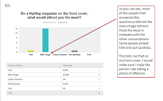
Questionnaire Results
I asked 16 people during a period of time to take my questionnaire and from that I analysed my results today. Here is what I ended up with:


Subscribe to:
Posts (Atom)