
Wednesday, 27 February 2013
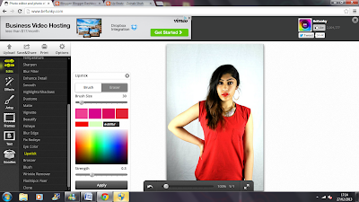
Edited front cover image
As the mast head and clothing are
red, my main colour running through the front cover is red. The image I took to
be my potential front cover image fits in well of what I expected apart from
one thing which was the camera did not pick up the vibrant red lipstick that would
of stood out if the camera did catch it. Then I went on the editing website (befunky.com)
to apply fake red lipstick and apply it on her lips. This is how I did and
looked like in the end..

Friday, 15 February 2013
Playing around with Indesign
From the lesson last week when I was introduced to Indesign,
I started to play around with it and by using my actual flat plan for my
contents page I thought I would see how it would look like by creating the
basics of my flat plan. I added in boxes of where my images would be places and
a one big box of where my text would be placed. Here is what I came up with (so
far):


1st step - front cover page
I decided which image of my model I would be using for my front cover page which as you can see is the one of my model wearing red. Why I chose this image to be on my front cover is because I thought the shot angel is a mid shot which is one of the conventions of Hip Hop/ R'n'B magazine covers that I have been researching on. Also because the eye level is looking direct and the camera which is effective as it looks more like the 'artist' is engaging with the readers.
I then used photoshop to make a start to creat my front cover page. As the orginal image as an effect of the background being faded from black to pure white (bottom right side going up), I thought this would look really effective as I would not have to play around with the background so much. I also wanted to see how an all plain background would look like. I did this by cropping the models image itself and pasting it on a black page. Why I did this is because I wanted to put both my potential front cover ideas together and see what makes a better background for my front cover. Here is what it looked like:
 I asked my teacher Miss Silva and my class mates which one looks better and everyone had said the left one (with the faded background) looks better than the plain one.
From their feedback, I decided to stick with the faded background image.
I then used photoshop to make a start to creat my front cover page. As the orginal image as an effect of the background being faded from black to pure white (bottom right side going up), I thought this would look really effective as I would not have to play around with the background so much. I also wanted to see how an all plain background would look like. I did this by cropping the models image itself and pasting it on a black page. Why I did this is because I wanted to put both my potential front cover ideas together and see what makes a better background for my front cover. Here is what it looked like:

From their feedback, I decided to stick with the faded background image.
Wednesday, 13 February 2013
Indesign
To help me create my contents page and double page spread, in class I was introduced something new which was a program called In Design. This program would basically help me create my contents page and double page spread with the use of the templates. Here is the tutorial video that helped me understand the basics of In Design.
Tuesday, 5 February 2013
Potential front cover images :)

My Inspiration -

I mainly tried to follow (in my own style and use of colour) the 2nd magazine front cover image of Nicki Minaj and with the 1st image of KESHA, I used that for the format of where my text would be placed on my front cover page (as shown on my improved flat plan.)
Potential Fonts for my Front Cover
I went on the website called dafont.com and was testing out different types of fonts that could be used on my music magazine front cover. I had to look for fonts that looked 'Hip Hop and RnB' type so it goes with the conventions. I found a selection of different fonts and decided to put them altogether as a collage.
 I have not decided which font I would use for my front cover, I probably will get people's opinions on which font for a title looks better and fits in more with my front cover image (that I will be editing real soon), and my genre itself.

Friday, 1 February 2013
Interview prep
Now its time to start planning and researching on the type of questions I will be using for my interview. I got given a sheet to start me off with planning my interview, here is what it included:
GENRE-
AUDIENCE-
PURPOSE-
FORMAT-
GENRE-
ü
What genre is the magazine?
ü
What type of artist might you be interviewing?
AUDIENCE-
ü
Who are your audience?
ü
What will your audience want to know?
PURPOSE-
ü
What information are you trying to get out of
your artist?
FORMAT-
ü
How can you phrase the questions to make the
artist give you the information you want?
ü
How many questions might you include?
Subscribe to:
Posts (Atom)